[dropcap size=small]T[/dropcap]he smartwatch has always been something of a misfit in the tech world. It’s a device that every gadget lover wants. The compromises necessary to bring the desired features to your wrist however are ones that make the realized device far less appealing.
The first smartwatch to gain any real adoption was the kickstarter backed Pebble watch. I had a chance to mess with one of the first runs of that product, and watched as my friend, its owner, agonized over the hardware and software problems it had. It was an interesting glimpse into what a watch could be, but a couple of hours with it was enough time to know that it wasn’t something I’d want to wear every day.
This year, hardware giant Qualcomm released a smart watch of its own call Toq (pronounced Tock). This Android only watch has a significant feature it hopes will set it apart from previous smart watches, a color Mirasol display. It also promises multi-day battery life and has a variety of apps, including a fitness tracker along with it. Will that be enough to satisfy Pebble defectors and gadget lovers alike? Let’s find out in our Busted Wallet review of the Qualcomm Toq SmartWatch.
The Reveal
 Opening up the Toq for the first time is pretty exciting. It’s packaged nicely in a premium box which has been a popular trend in the smartphone era. Adding to that excitement, the fear kind of excitement, is the Toq wristband which needs to be sized and assembled before you can put the watch on. This is a nerve wracking process as it involves taking an approximate measurement of your wrist, and then physically cutting the wristband to size. Making a mistake here will be a big problem as the wrist band has touch points built into it which I’ll mention later. Obviously once you cut it, and if you cut it too short, there is no going back. So take your time.
If all went well, as it did for me and likely will for most, you’ll have a comfortable and durable watch band sized specifically to your wrist. The band is outfitted with a butterfly style metal clasp which expands the band for removal from your wrist and locks firmly in place for normal wearing.
Looks and Style
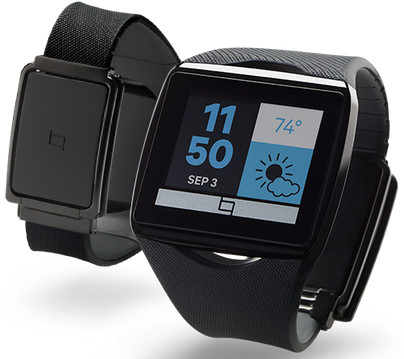
The watch looks pretty good, especially for a smart watch. It’s big for my taste, and I was a little self conscious of it at first, but my wife thought it looked good and my co-workers didn’t think it drew too much attention. My review model is the black version which I prefer over the white. The touchscreen has a large bezel around it, part of which holds a logo, adding to its size. I suspect the bezel is a necessary evil from the display technology, but if it were edge to edge screen, it would look even nicer. The band is made of a sturdy type of rubber composite that feels nice on your wrist and looks sporty.
You’re not going to wear this watch to a fancy dinner or event, but for daily use and business scenarios, it looks casual but sleek, if not slightly geek.
The Display
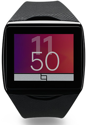
The display on this watch is quite unique. The closest thing to compare it to is e-ink which you may have seen on a Pebble watch or more frequently on a Kindle. Dubbed Mirasol, this display technology is able to reproduce color without a back light. Instead, Mirasol uses a reflective lighting technique which leverages outside light to produce its display. Since it can do this without a back light, the display does not consume battery the way something like an LCD display on your phone would. The result is quite good, especially in bright daylight. Colors looks nice and text is crisp. Unlike the product shots you’ll find on Qualcomm’s website however, don’t expect the colors to pop and be saturated like they are on a cell phone.
For the times when there isn’t enough light to see the display, there is a low tech back light available which can be actived by tapping the top of the wrist band two times. This kicks on the back light and enables you to read the watch. In this mode though, colors looks pretty bad. It’s clear that there are limitations to the Mirasol color capabilities. The important thing is that you’ll always be able to read your watch, day or night. It just looks better in the day.
Battery Life
A major hold up in widespread adoption of smart watches is battery life. As consumers, we want it all. Amazing displays, network connectivity, processing power, and infinite battery life. The reality is that you always need to compromise when you have a limited power source. The Toq does a remarkable job managing its power and producing extended battery life. The face of the watch is an always on touch screen which is ready and waiting for an event to occur. Qualcomm has engineered this feature to have extremely minimal battery draw by locking the screen during idle times. The Mirasol display doesn’t require a back light which saves a vast amount of energy. The apps are largely powered by your Android phone to save heavy processing from occurring on the device. Communication with your phone happens over a low power Bluetooth connection. Most notifications you receive on the watch are accompanied by a vibration which I suspect is one of the larger consumers of power. All of this carefully thought out power saving engineering combines to provide you with what Qualcomm claims is up to 6 days of battery life. In my multi-week test though, I saw an average of 8 days of battery life. That is unheard of for a smart watch and is one of its greatest strengths.
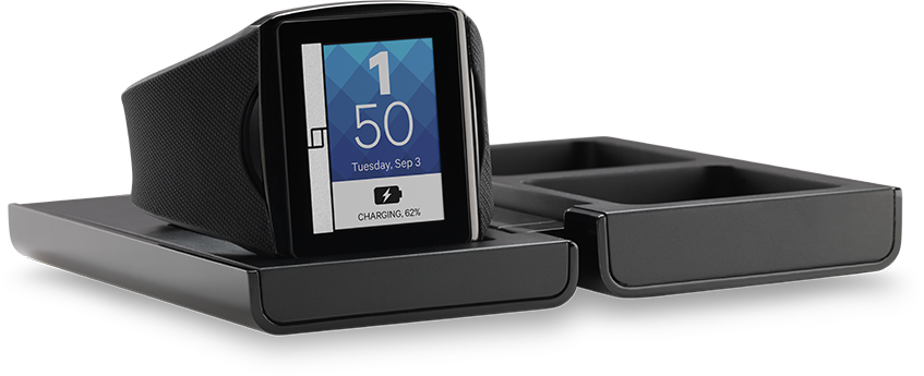
 The watch is charged using a provided wireless charging station. The charging station is a collapsible case about the size of an analog watch box. When you open it you’ll find two jewelry compartments to hold rings and things, and a pop up charging wall that the watch will rest against for charging. It works well and looks pretty good on your desk. It also comes in handy for travelling.
Functionality and Usage
The Toq watch face is an always on touch screen that can respond to taps and swipe gestures. In addition, the watch band itself has touch points both above and below the screen. The bottom touch point servers to unlock the touch screen and also navigate backward through the app stack and to the home screen. The top touch point is used to activate the watch’s back light. Both of these touch points are used to great effect and it’s remarkable that nobody has thought of this feature until this point. When the touch screen is active, simple taps and swipes allow you to choose apps, move between screens, and scroll with ease. Everything does what you’d expect it would and it does so with accuracy and responsiveness. It’s a good and functional touch screen.
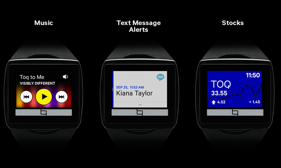
The watch is powered by your Android (only Android at this time) smart phone. A Toq app is installed on your phone and the watch pairs via Bluetooth. You use the Toq app (much like the Pebble app) to control and configure your watch. You can choose which clock faces to use, set up your stocks for the E-trade powered stock app, set your weather location and more. The watch also includes a fitness tracker which records and reports on your activity. Steps taken, calories burned, that type of thing. Using the fitness tracker does reduce battery life though, so while that information is kind of interesting, I turned it off.
 The main bit of functionality powered by your phone comes from setting which apps you’d like to receive notifications from. This allows your watch to tap into just about every app on your phone if it provides notifications. That means that your watch becomes a heads-up display (HUD) on your wrist for your phone. It’s pretty awesome. You can get alerts from financial apps, news apps, and weather apps. You get calendar and event reminders. You’ll see all of your e-mails, chats, and text messages as they come in. All without having to take your phone out of your pocket.
Another app I found very useful is the music controller. I often connect my phone to my car to play music, but reaching for it to change a track while driving is a nuisance and dangerous. The Toq has a built in music controller which can connect to Google Play Music (and a few select 3rd party apps) and not only show you what’s playing but let you move between tracks, stop, and start music. It’s also equipped with a weather app powered by Accuweather, an appointment/calendar app, and a stock app powered by E-Trade. Added into the mix is a phone notification and action app which lets you see who is calling and accept (better have a headset on) or reject the call right from your wrist.
Oh, and it tells time on any of its more the 13 watch faces.
Conclusion
I started to find this watch useful and convenient from the first day I put it on. I liked being able to view everything that was happening on my phone at a glance, even when sitting at my desk. I use it regularly to control music in my car and check the weather. It’s a little big, and the band clasp is large/thick and tends to bang into stuff. It’s big enough that I take it off before going to bed. The thing that started to wear on me though was the very purpose of the watch, a more connected experience. The trouble is, my life is super annoying. I’ve got over 10 e-mail accounts connected to my phone which means I’m getting wrist vibrations that I’m compelled to look at like once a minute all day every day. I think that’s more a problem with me than it is the watch though.
All in all, I can say that this is the best smart watch I’ve seen or used to date. It’s modest price and solid capabilities make it a good value. I’d like it more if it looked like a normal watch, but at least it looks nice for what it is. It’s not the smart watch geeks are dreaming of but it’s a solid step in the right direction. One thing’s for sure, there is money to be made by the first company to release a smart watch that gets it completely right. With Google and its hardware partners set to release a slew of Android powered smart watches later this year, and Apple rumors pointing to an offering of their own, the space is really heating up and Qualcomm is ahead of the game.
[button color=”red” size=”normal” alignment=”none” rel=”follow” openin=”newwindow” url=”http://www.amazon.com/gp/product/B00GGGQHPO/ref=as_li_ss_tl?ie=UTF8&camp=1789&creative=390957&creativeASIN=B00GGGQHPO&linkCode=as2&tag=bustwall-20″]Buy Now: $249.98[/button]
- Fantastic display in bright light
- Class leading battery life
- Good collection of apps
- Android Only
- Color display underwhelms
- Pretty Large


[…] Qualcomm Toq Smartwatch – Tech Review […]