As a fully remote employee, there are significant benefits to the at-home work revolution… no time lost on commuting, no gas cost for commuting, no lunch packing or outfit planning, and time to do chores or run errands on lunch.
While all those things are amazing, for a social person like me, full-time remote work can get lonely and draining. So, what do you do? Get out of the house and explore places to work! Coffee shops, libraries, heck, even breweries on a Friday afternoon. Or, even better, hop on a plane and work in a new city, work at a friend’s house across the country, etc.
espresso Display’s slogan “do more, anywhere” is fitting for my scenario.
Let’s dive into the espresso Display review! I’ll cover the display itself, a few of its accessories, and how it fits into my workflow.
Key Features
- World’s Lightest 650g & World’s Thinnest 5.3mm
- 1080p resolution
- Touch capability
- 300 nit luminance
- Thin & lightweight
- 6H Hardness Glass
- Easy single-cable USB-C connectivity
- Aeronautical-grade aluminum construction
- No external power needed (for most devices)
- Touchscreen for Mac & Windows
[divider] espresso Display 15” Touch Review Breakdown [/divider]
Design
When seeing this display in person, the first thing you’ll notice is how sleek, slim, and lightweight it is. It is impressively thin; thinner than an iPhone 12 & 13 thin. For a solid idea of thinness, the espresso Display (without the case/cover on it) is about as thin as the front, thinner edge of a MacBook Air when closed. espresso claims this is the world’s thinnest portable monitor, and I don’t think you’d argue that!
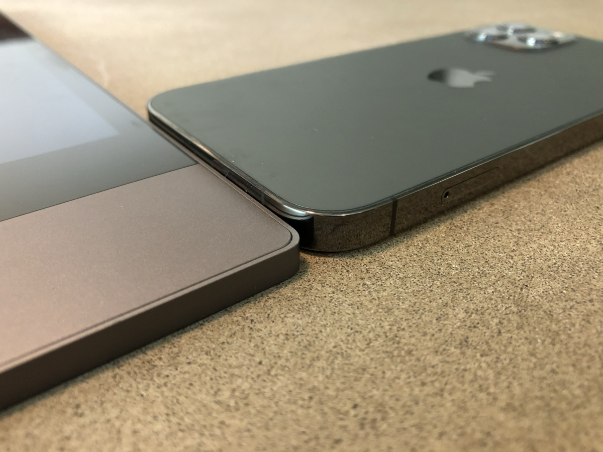
Next to iPhone 12 Pro
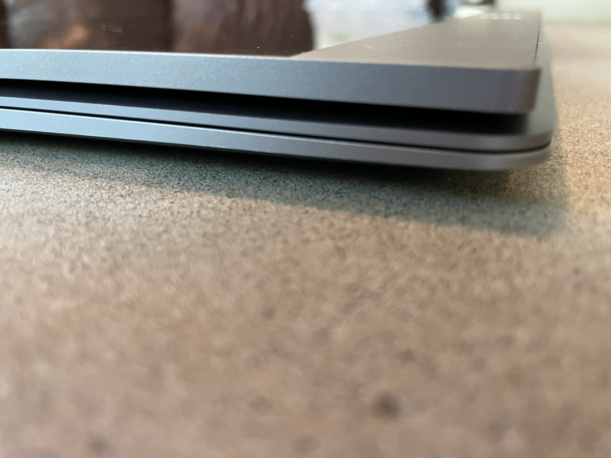
Next to leading edge of M1 MacBook Air
The next thing you’ll notice is the build quality. Machined from Aeronautical grade aluminum, the display housing is reminiscent of the Apple products I mentioned above. Clean and sharp lines with no scrap metal or unfinished bits to catch a nail. All that is topped by a finish that is soft and smooth to the touch.
It looks good from all angles – it looks good set up, it looks good closed, it looks good stacked under your computer, and it looks good packed in your everyday carry bag. It is extremely aesthetically pleasing.
That said, I do wish they could have reduced some of the “chin” below the display. I know it had to be there to house the electronics so the panel could be so thin. Future tech should allow this in Gen 3, 4, etc.
Daily Set Up
With single-cable connectivity – yes, that means no external power source – set up is as fast as un-sleeving and opening your laptop. When using the espressoCase, all you do is simply flip the microfibre cover over, bend it back, adjust the angle, and plug it in.
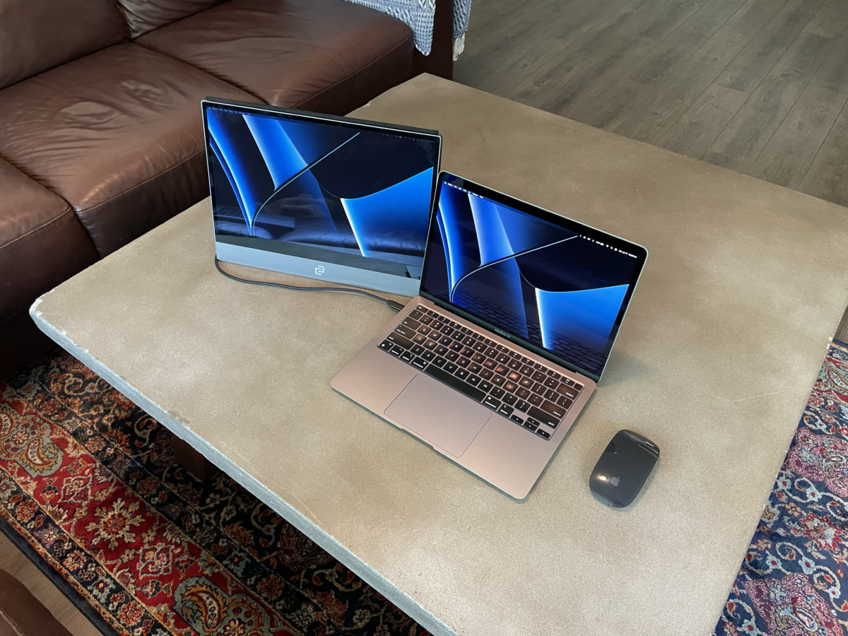
With 13″ M1 MacBook Air
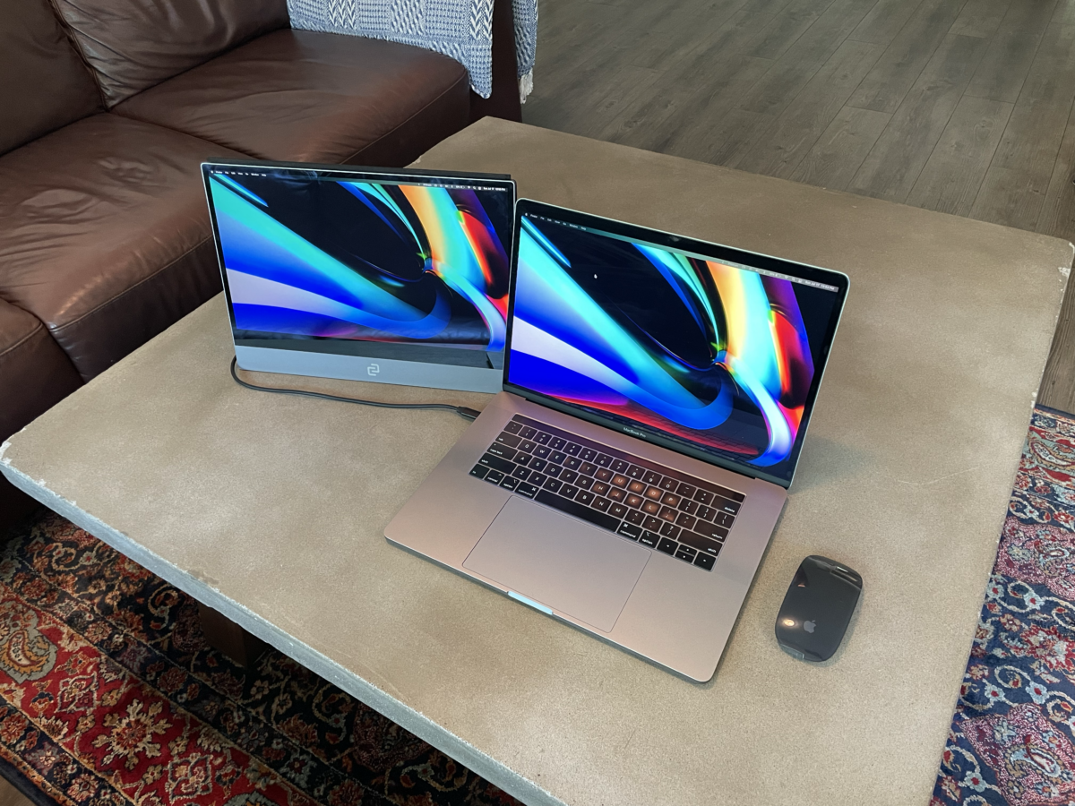
With 15″ Intel MacBook Pro
When using the espressoStand, setup is a tad longer as I find the stand adjustment to be a bit finicky – more on that later in the accessories section
In either case, you’re looking at a setup time of about 1-3 minutes, which means you can still get two monitors going nice and quick when your coffee order took 5 minutes longer than expected to receive.
One note, upon first unboxing and setting up your espresso Display, you’ll need to get a few things configured like the espressoFlow app for Mac and Windows, as well as screen orientation and all that good stuff. So make sure you allow for some extra time there.
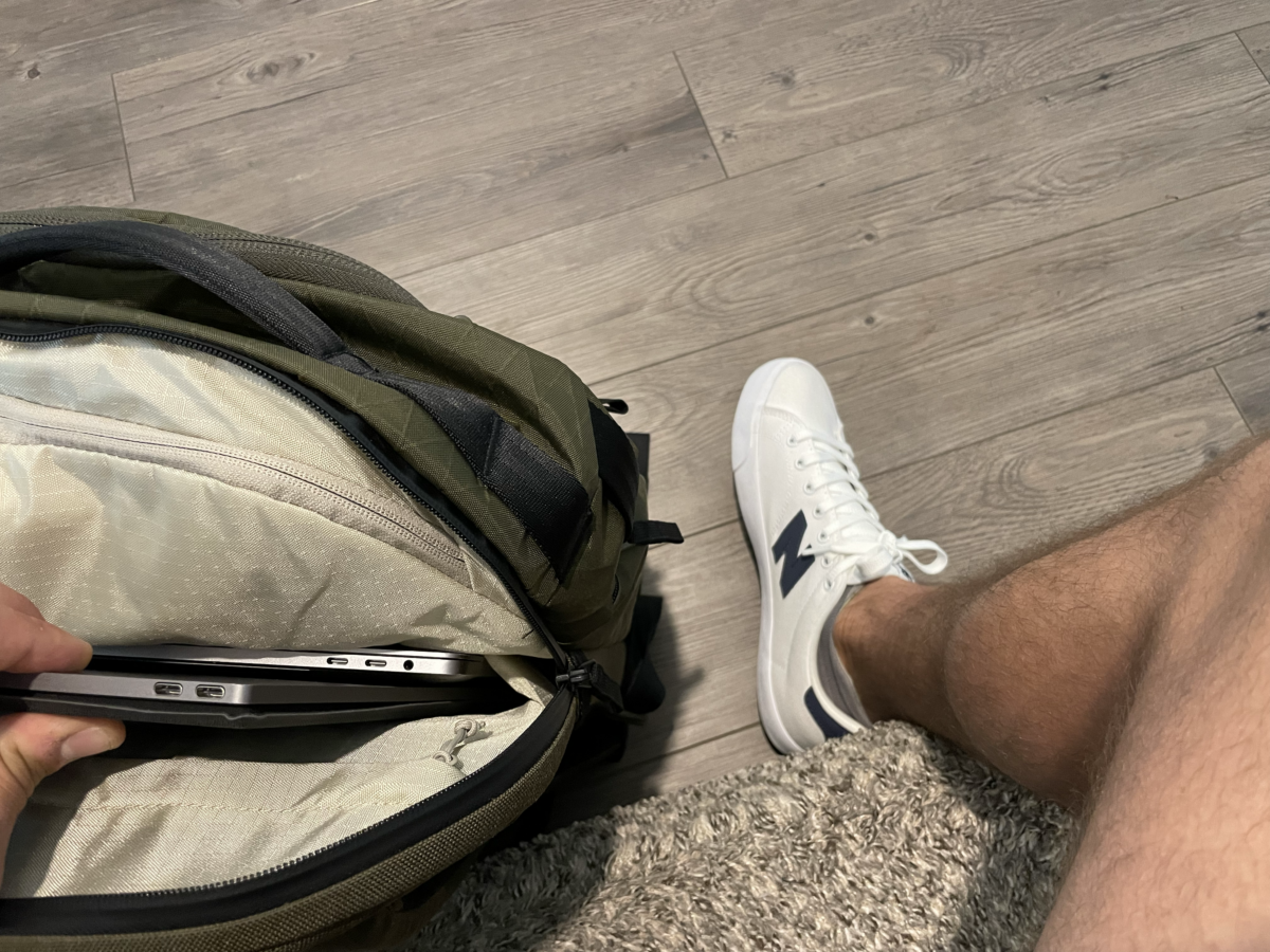
Packed in Able Carry MAX travel bag
Display
At 1080p, you’re not going to get the crisp, clean text you’re used to seeing on a HiDPI display or Retina/Liquid Retina Apple display. However, for the use case(s), form factor, and price point of this display, 1080p is great.
If I had to guess, a 2k or 4k version – which would allow for more pixel density and the ability to render and scale more crisp text and icons – would be more power hungry, ultimately requiring external power. When working in coffee shops, libraries, airports, etc., wall plugs and power options are often limited, so I appreciate the decision to go 1080p to ensure there’s single-cable operation.
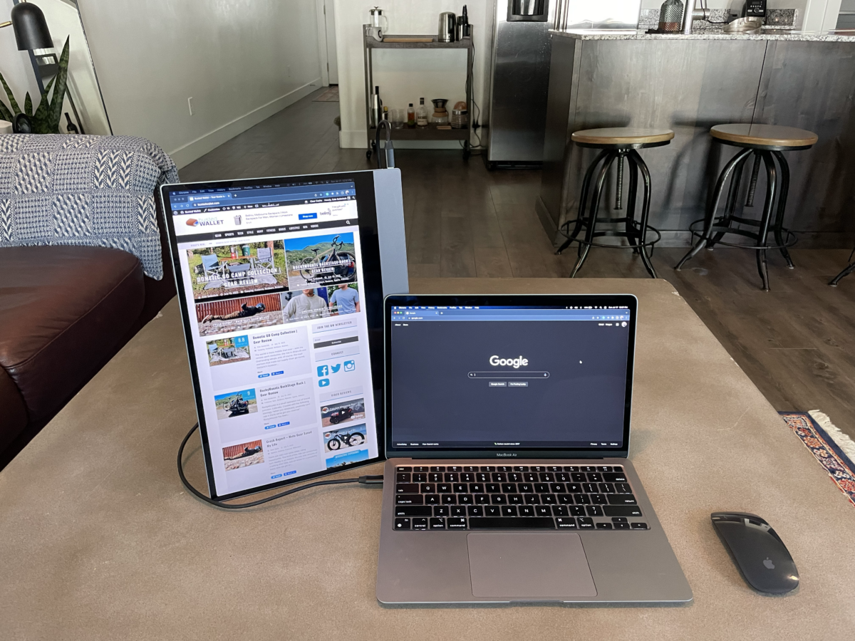
Portrait mode using espressoStand
Working as a digital marketing manager, I am not in need of perfect colors or anything that a photo, video, or graphic designer would need to worry about. So for me, the colors are vivid enough, but are certainly more muted than my M1 MacBook Air that I work on daily.
One miss is display brightness. A glossy glass coating and only 300 nits can make this display very reflective and hard to see in certain situations. While my M1 MacBook Air only does 400 nits, that 100 nits difference is pretty significant in everyday usability. I usually try to find the darkest corner of the room when setting up my espresso Display.
Accessories
When I was offered the opportunity to check out the espresso Display, the espresso team included a few accessories – espressoStand, espressoCase, and espressoPen.
espressoStand
Honestly, as cool as the espressoStand looks – and sounds due to its magnetic hold – I find it more frustrating to use than enjoyable. The stand folds down compactly, but the magnet feels a bit weak for the 15” version of the espresso Display. I find getting the angle right a pain as the magnet releases frequently while I adjust it. Additionally, once I finally get the angle dialed, the display is unstable and wobbly.
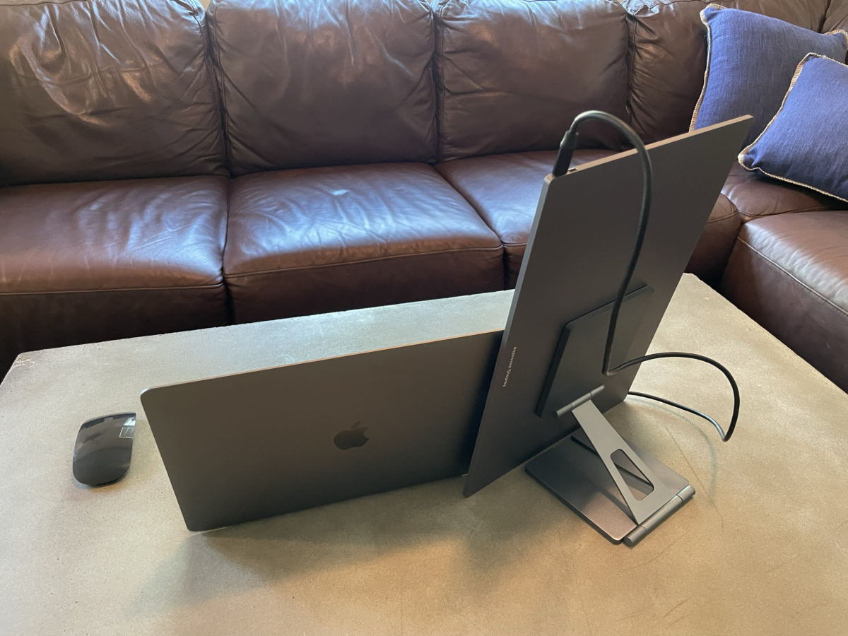
All that said, I think the espressoStand likely works great with the smaller 13” version – less weight, easier to adjust.
$69 for both sizes
espressoCase
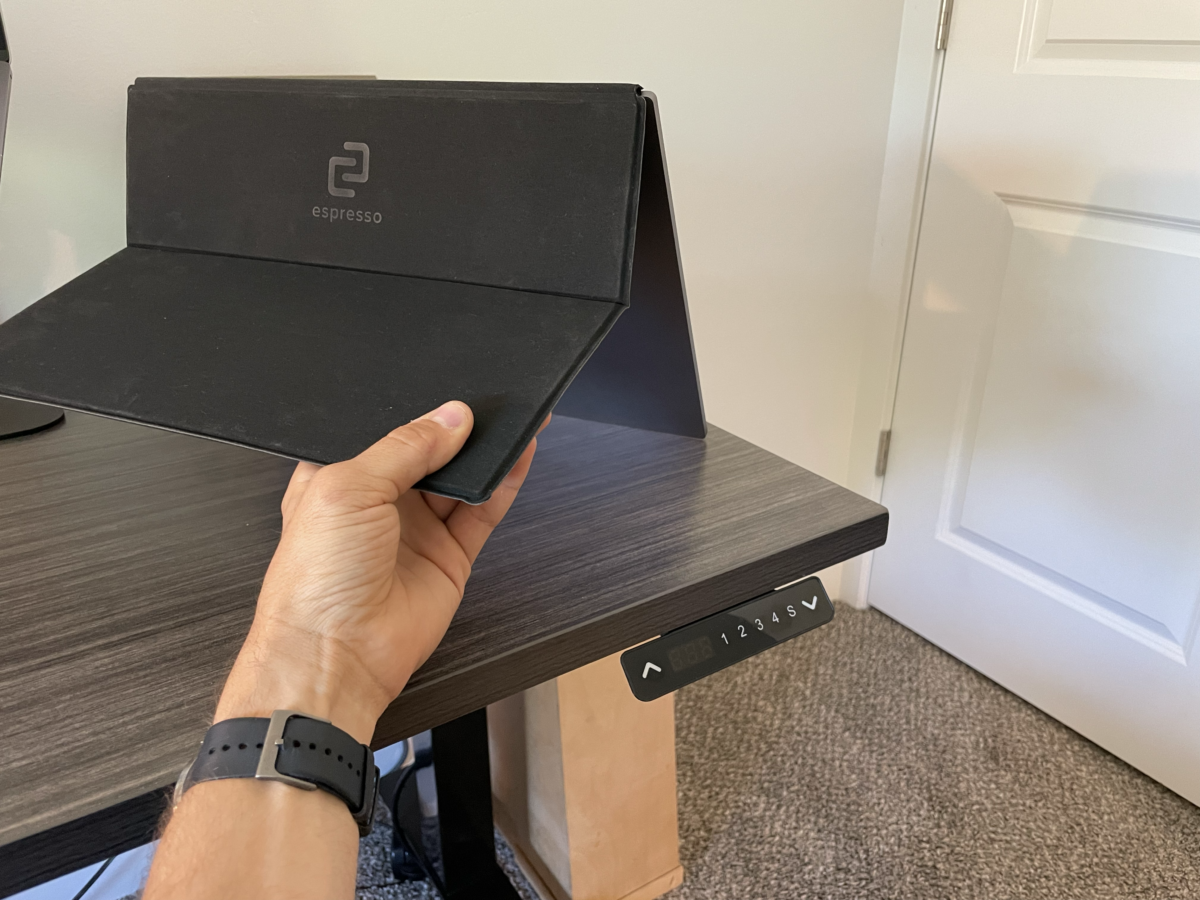
The espressoCase is a solid, yet standard portfolio case. It is not dissimilar to a case you’d use on an iPad or Android tablet. It has a soft, microfibre liner to protect against screen rub and scratches, and a rubberized feel on the external side. It magnetically attaches to one side of the espresso Display and has one single fold point that can be adjusted to fit your viewing angle preference.
As simple as it is, it is my favorite way to use the espresso Display – it’s light, protective, and easy to use. Sometimes, simple wins.
$39 for both sizes
espressoPen
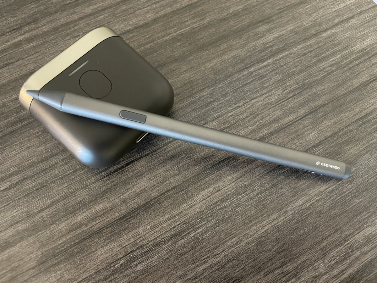
In my opinion, the espressoPen is a nice to have. I personally do not do any digital creative work like sketching or markups in my personal or professional work, so it isn’t part of my standard workflow. For someone who does that type of work, I believe it could be a nice way to supplement a Wacom touch tablet or save you a few hundred on buying an iPad and Apple Pencil. But, I’ll caution that with a caveat about the experience. It is not buttery smooth, or insanely precise. It is a nice feature that works well enough for this price point. It may or may not perform better with a PC. It charges quickly via USB-C, which is a nice standard at this point in time.
$79 for single pen
espressoFlow
espressoFlow is espresso’s software to improve your day-to-day experience with the espresso Display. While you can plug espresso Display into any machine without espressoFlow, you miss out on subtle enhancements like auto-rotate screen orientation, rotation lock (especially useful when using espressoPen with the Display, desktop control over brightness, and easy 2nd monitor arrangement control. It’s free for Mac and PC, so it really is a no-brainer to add to any machine you use on a regular basis.
Value
At $499 for the 15” Touch version, it is a bit pricey… but you certainly get what you pay for. Cheaper options for portable displays are a lot bulkier and have poor power management, meaning you’ll need external power which is not ideal for a mobile-first solution.
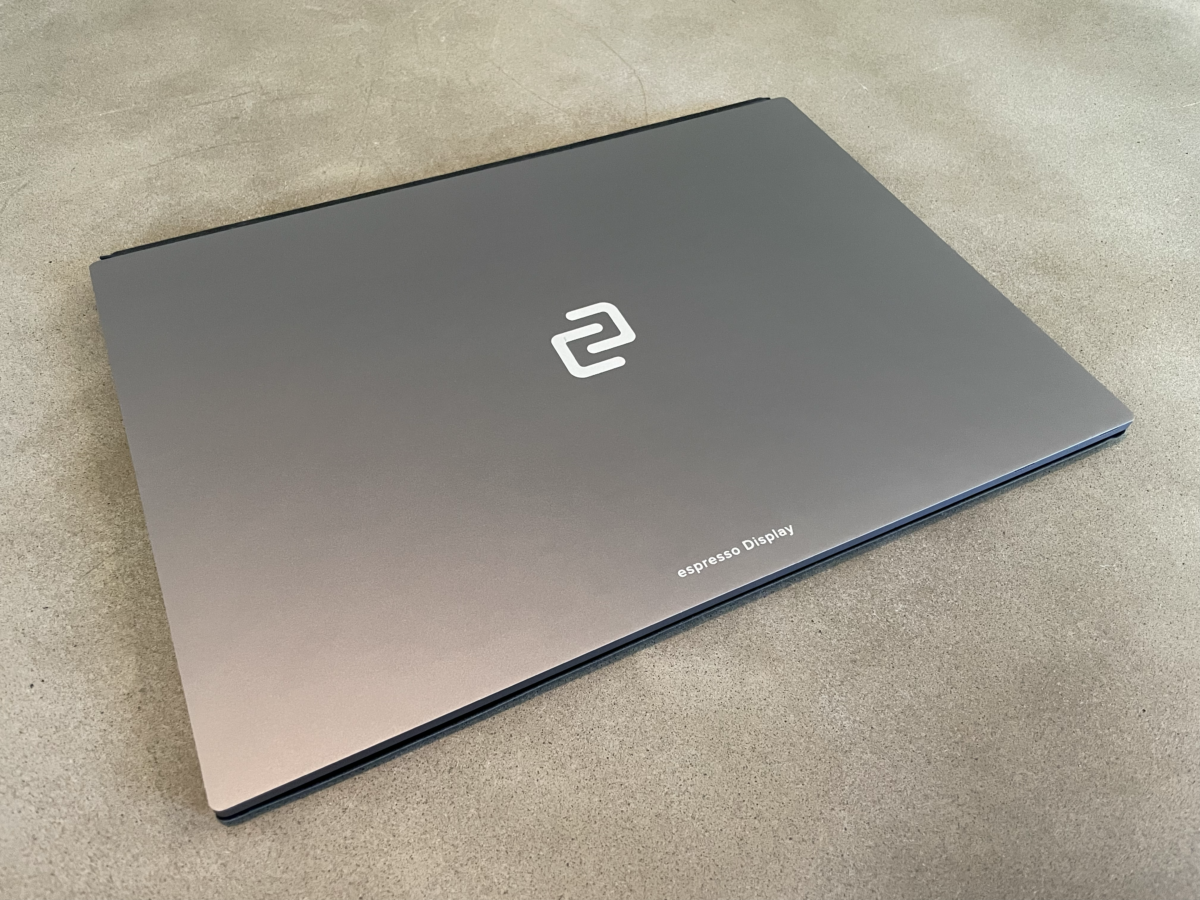
To save some cash, you can easily opt for the 13” Non-Touch version, which will save you $160 at checkout. As someone that really doesn’t need the touch, the 13” option is a really nice hyper portable solution.
Overall, espresso delivers a highly refined device that easily integrates into your workflow, and that is worth the extra cash to me regardless of the size you pick. I do find it a bummer that you have to pay for one of the mounting options. It does feel like the $39 case should be included at a minimum, but everyone has a different need and goal for this Display, so I suppose it allows you to pick what you think you’ll use most.
Configure your espresso Display today from $339
- No external power needed
- Quick single-cable setup
- Super thin and packable
- Brightness is lacking
- Display is a little glossy for the lack of brightness

Leave a Reply